funcheapsf.com
March 2024
In this 2-3 week sprint, I redesigned funcheapsf.com in Figma and coded the responsive (but not functional) website using html, css and javascript alone.
Part 1: Picking webpage
FunCheapSF is your ultimate guide to budget-friendly entertainment and activities in San Francisco.
I chose FuncheapSF.com as my website because I spent my past two summers in the Bay Area and used the website frequently.
What were the problems?
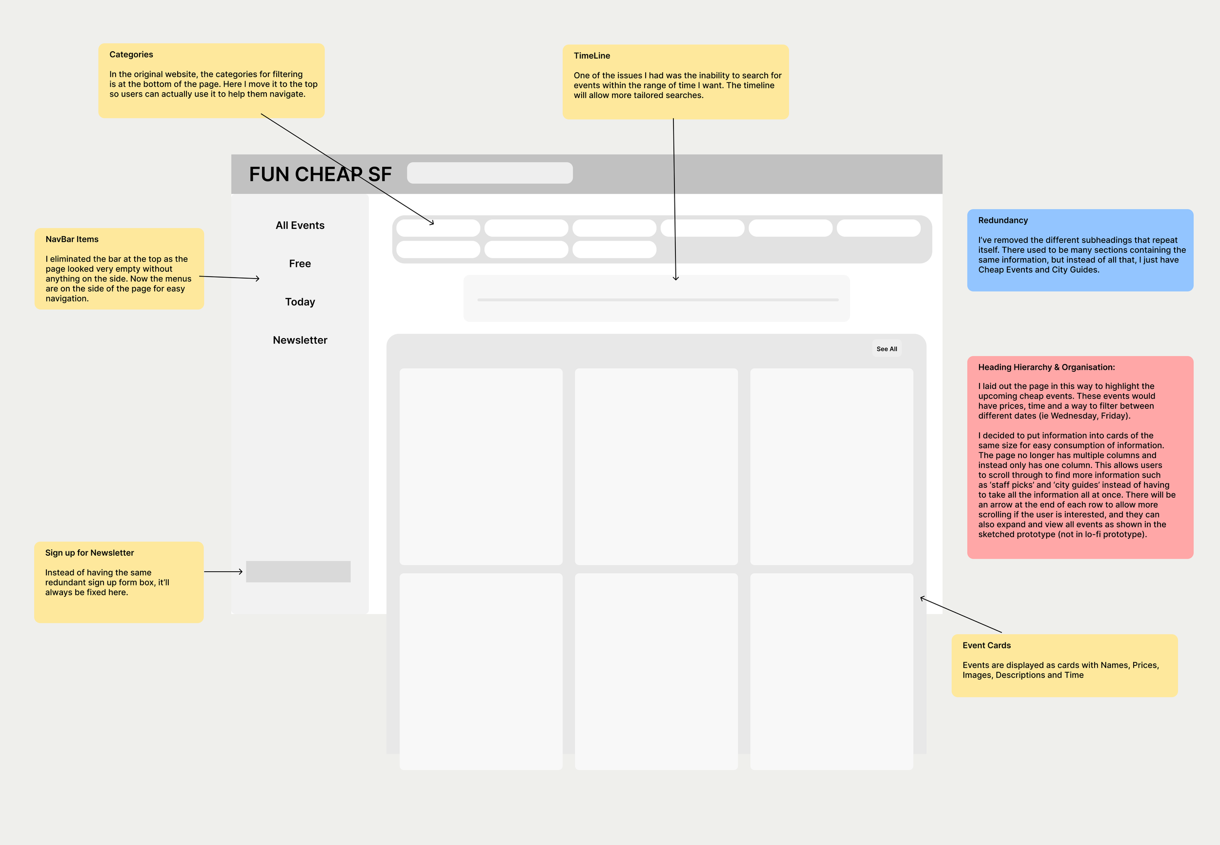
Redundancy
There are too many ways to access fun cheap events. On the home page, there are sections containing the same information. Upcoming Fun and Cheap Events, Funcheap’s Top Picks for this week have many overlapping events, but some have images in the thumbnail but others do not. There are filters at the bottom of the page by Categories and Locations which is difficult to find. Clicking on a category takes the user to another page.
Heading Hierarchy & Organisation
Headings for this website are separated into two columns, making the page look cluttered. The titles are also very long, and some headings are actionable phrases which don't seem suitable as a heading, for example, Sign up for Funcheap Emails.
Font size & Color
Large headings are blue with a grey highlight, newsletter categories are also highlighted in grey which makes it difficult to tell at first as a category. A lot of box colours are used to separate out headings from content, dates from description, but overall it doesn’t look very neat.
Accessibility
I conducted an analysis using WAVE.webaim.org and detected a couple of problems. There are missing alternative text to several linked images, many images are missing labels and several empty links. This makes it harder for users to find out more information about an event if the link is missing. WAVE also detected low contrast errors, which didn’t bother me very much personally.
Part 2: Visual Redesign
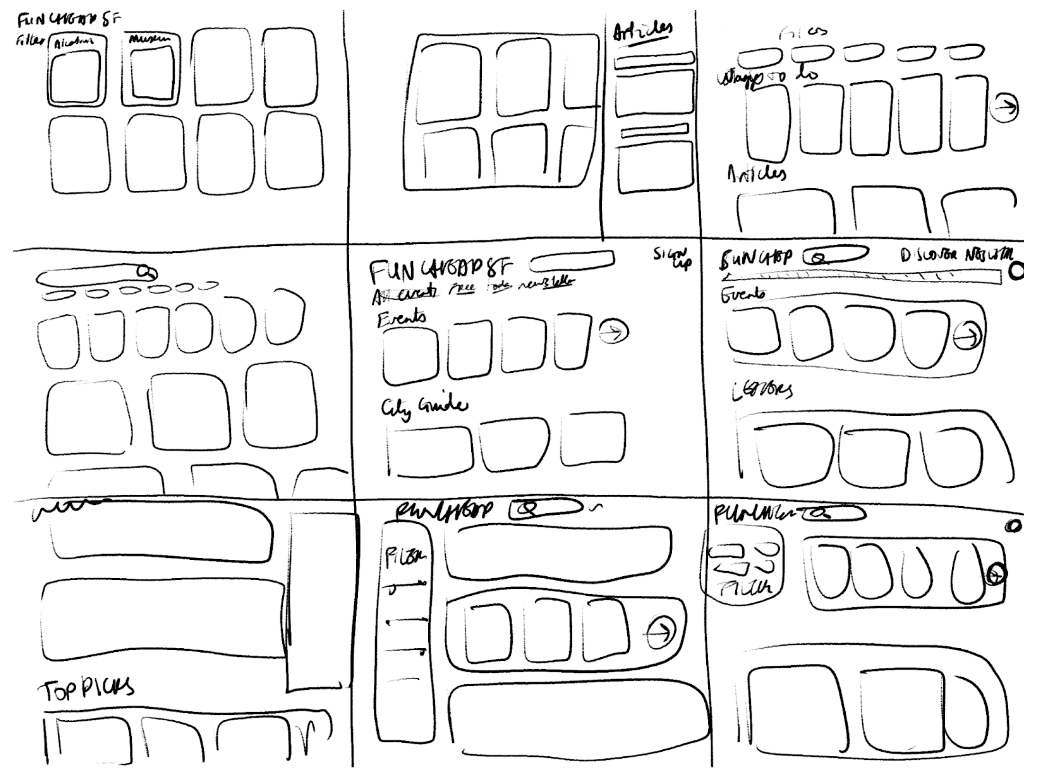
Quick Sketch
I created 9 quick sketches in 9 minutes to roughly plan out initial ideas.
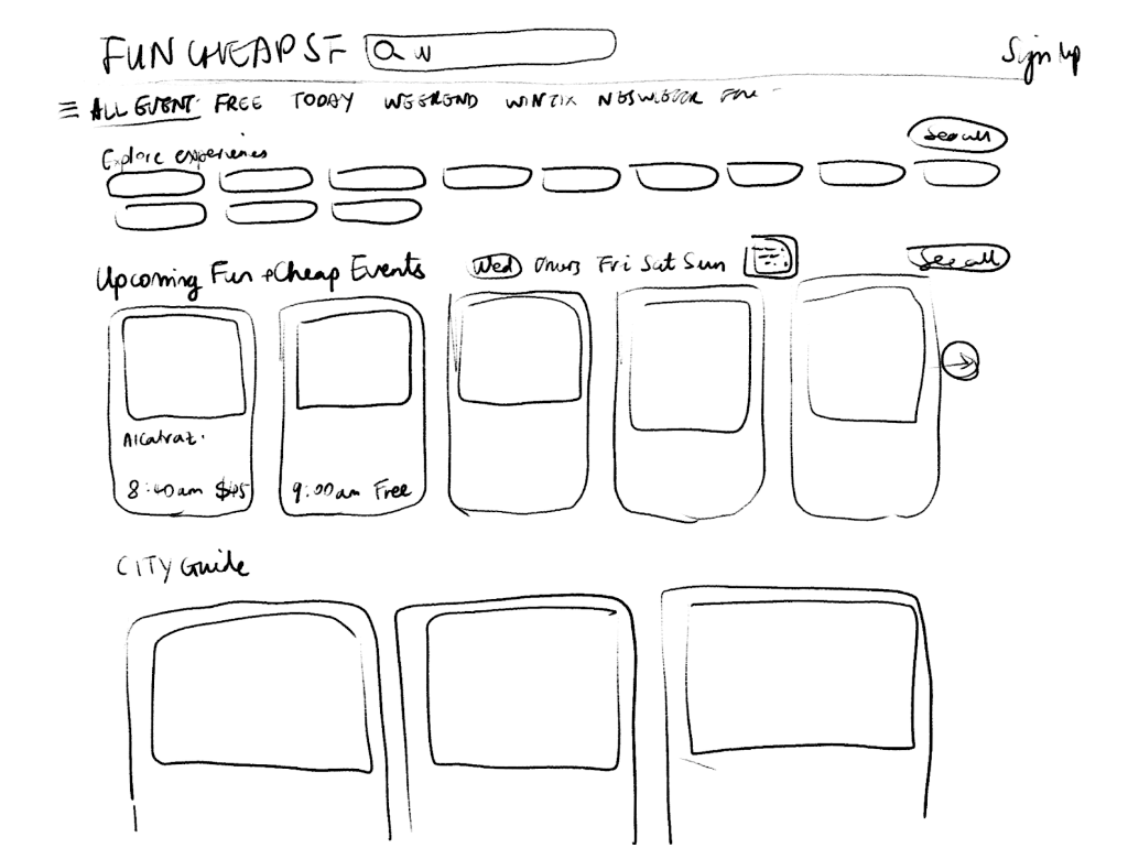
Final Sketch
Based on the quick sketch exercises, one design/layout emerged. It contains a logo bar, a filter bar with categories, and a section for event cards to be displayed.
Lo-fi Wireframe
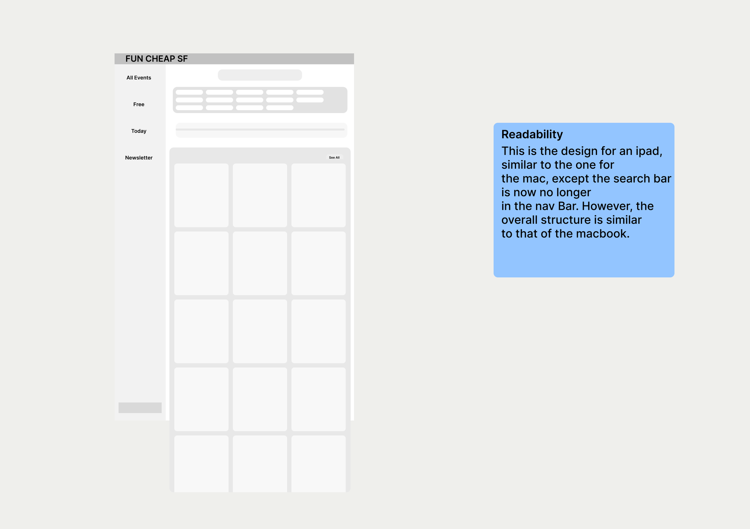
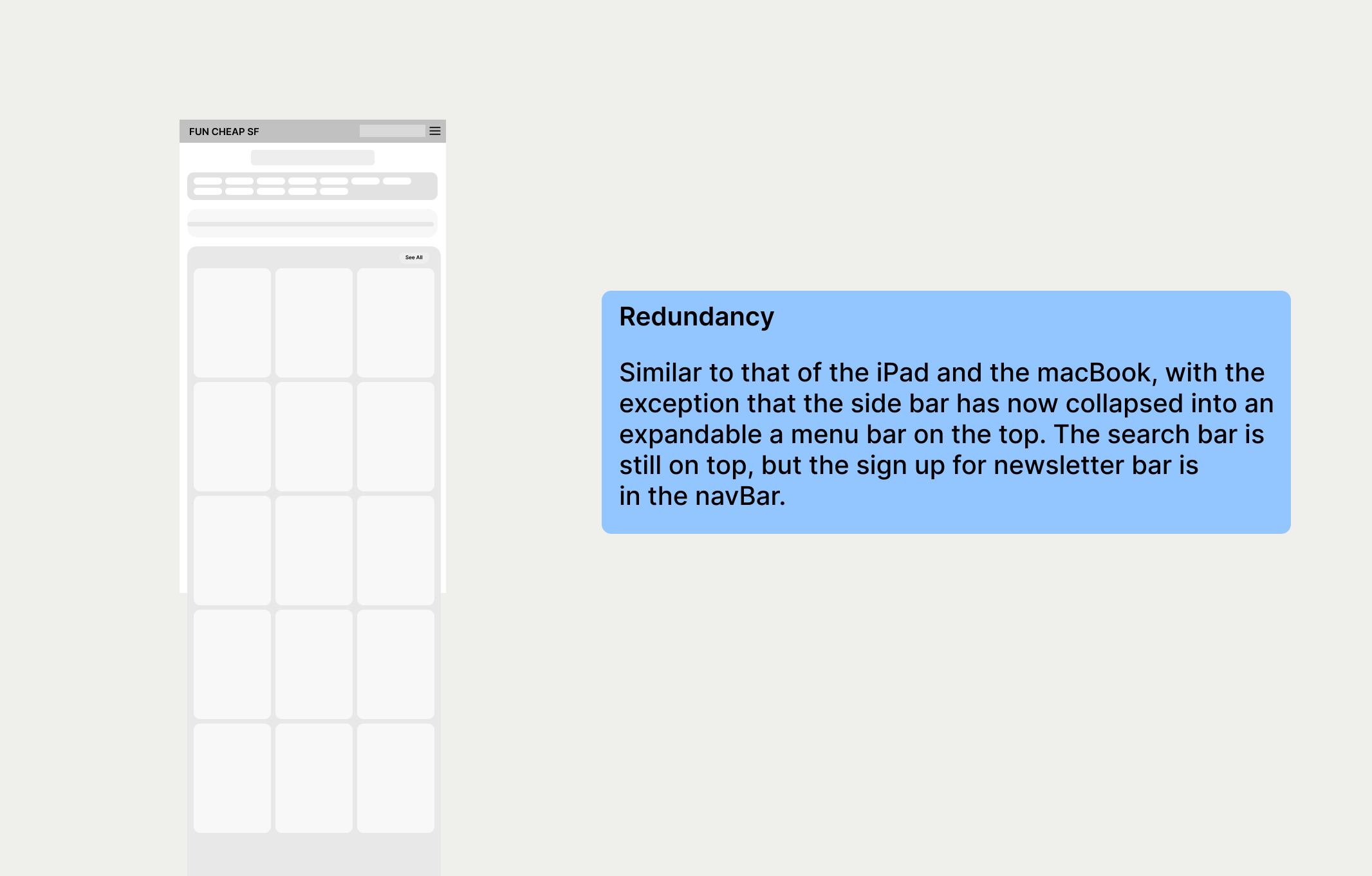
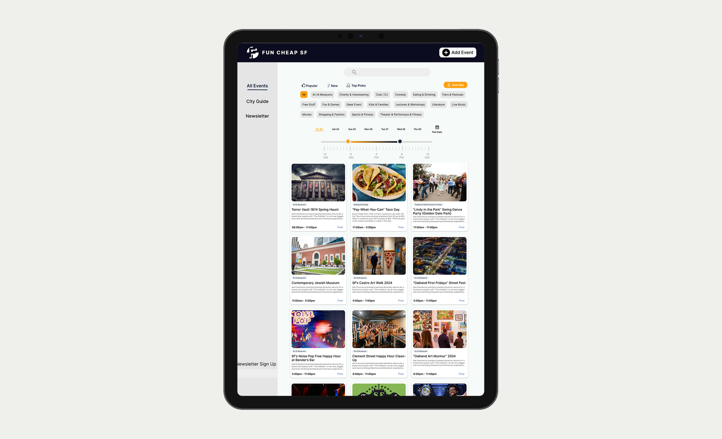
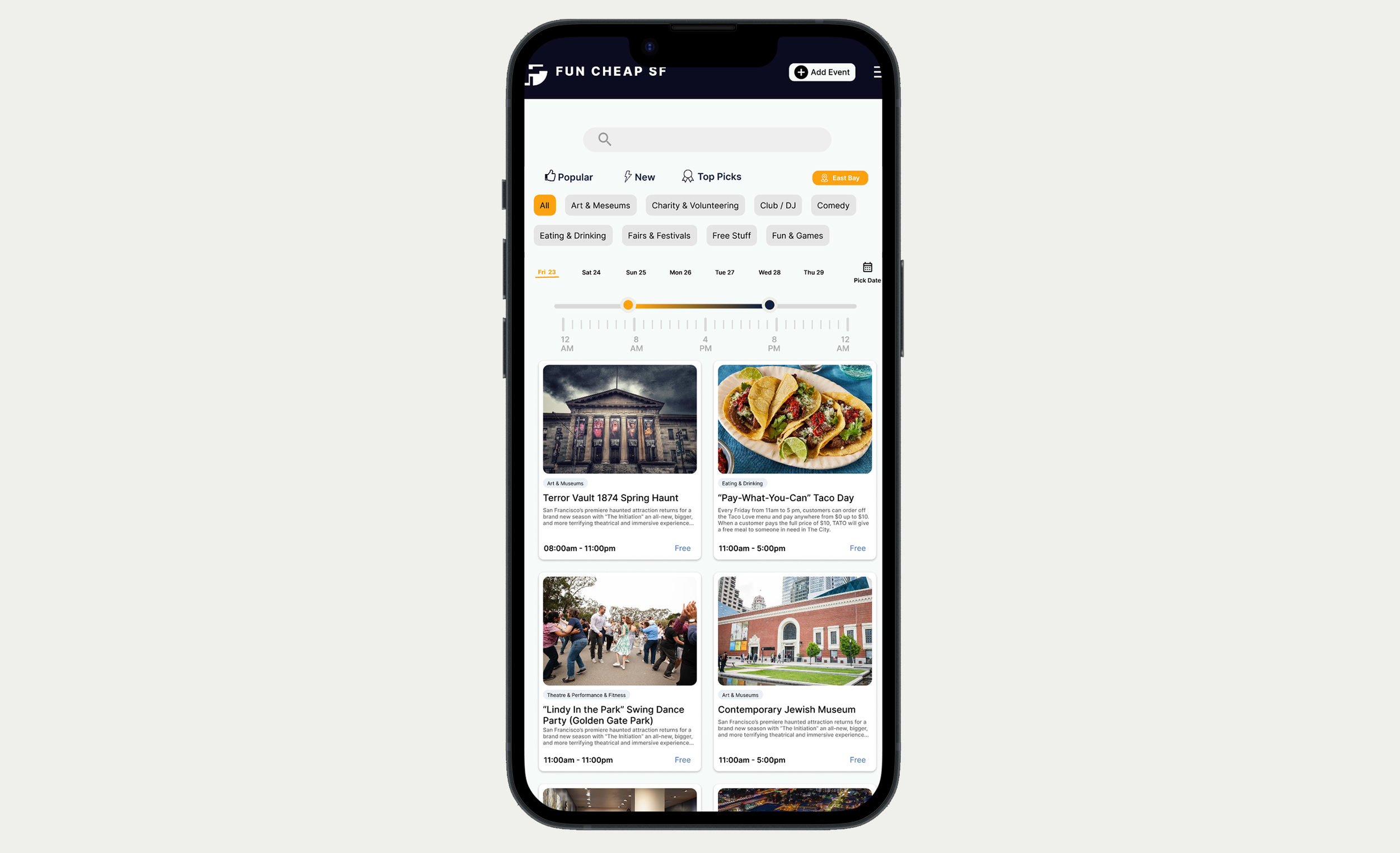
I created low-fidelity wireframes for mobile screen, tablet screen and desktop screen. The wireframes are adapted for the dimensions for the screens and seek to fix problems identified in Part 1.
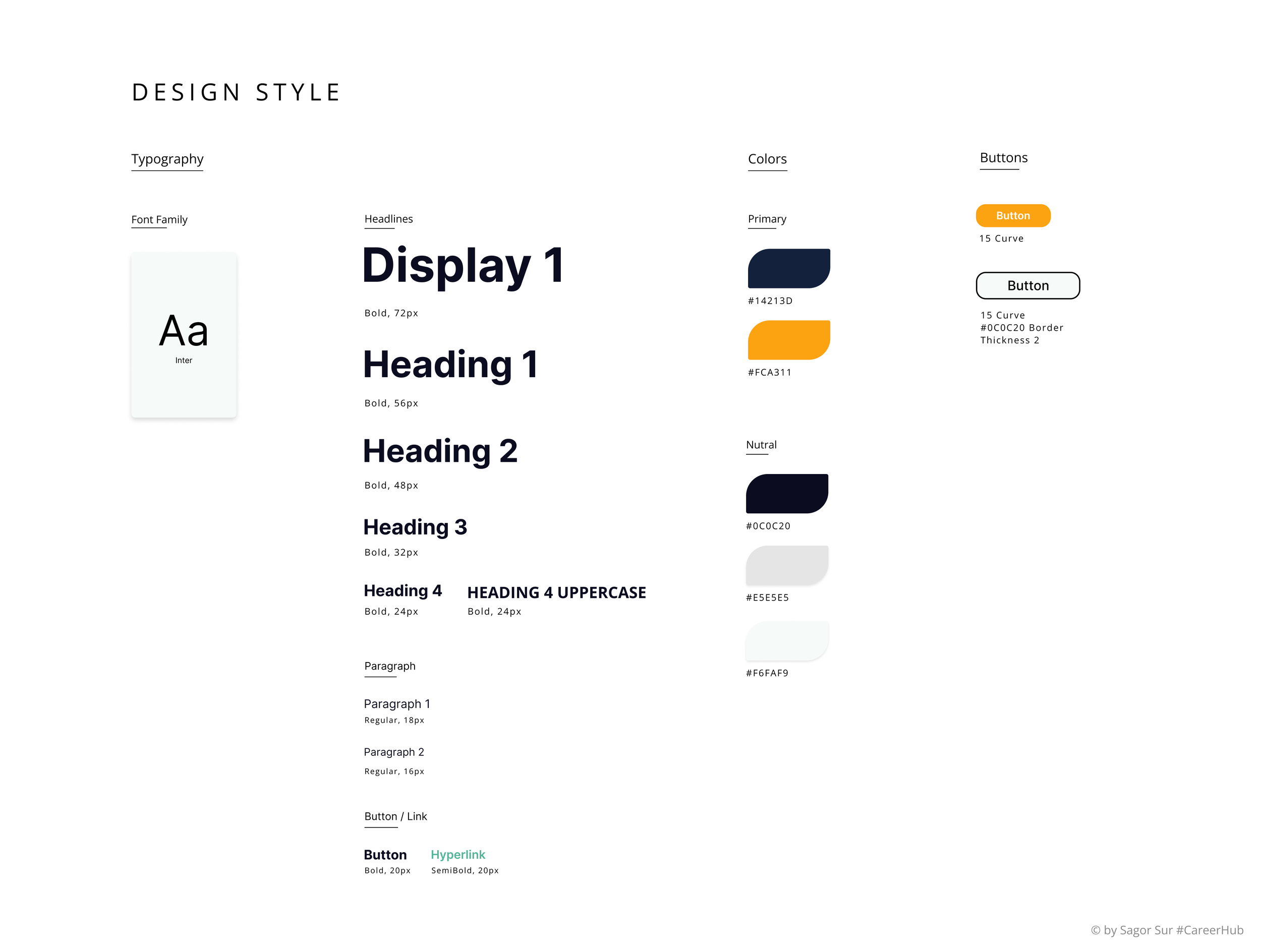
Style Guide
I chose minimal colours as otherwise it was too distracting, and I decided to use yellow and dark navy blue to indicate time of day in the timeline design.
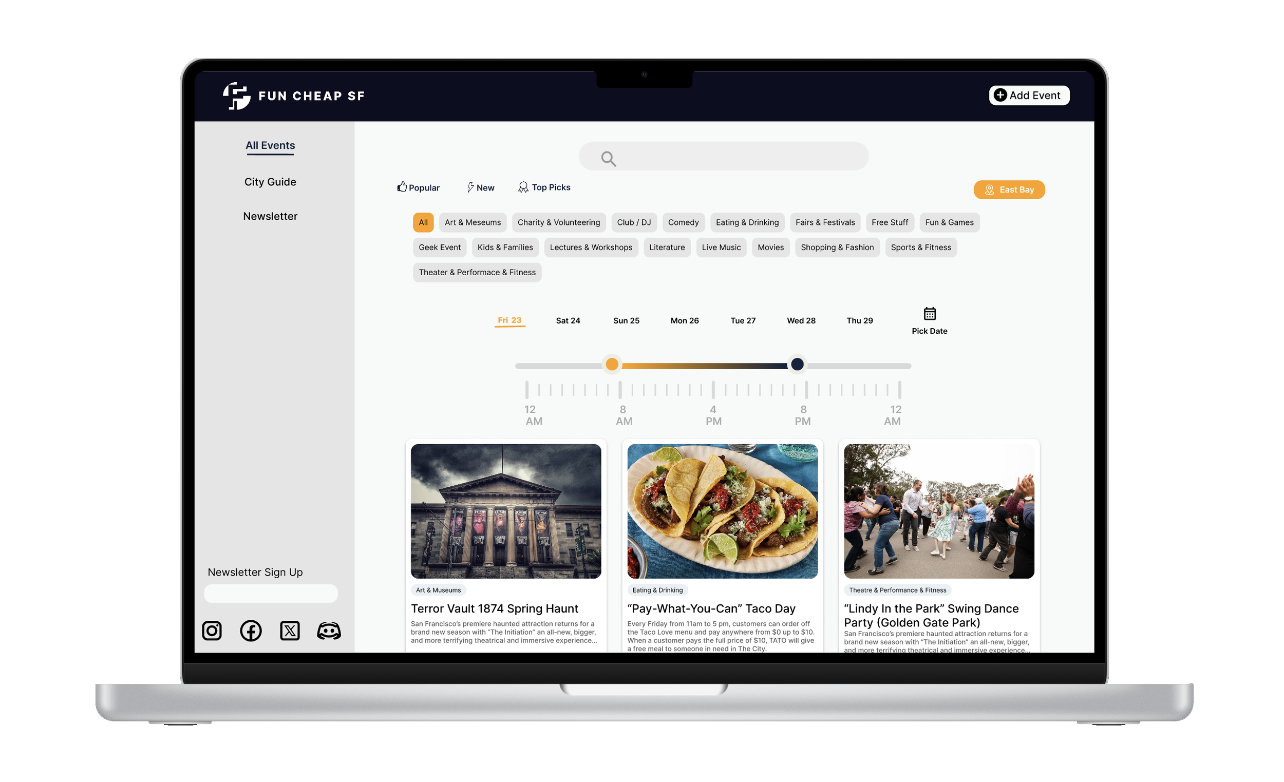
Hi-fi Wireframe
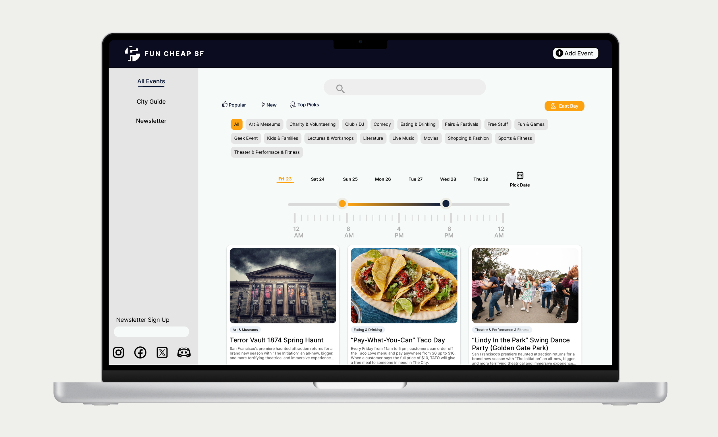
For the high-fidelity prototypes, I designed for the MacBook, iPad as well as iPhone. I designed the time bar filter in the high-fidelity which allows the user to only view events within the range of time they want.
Part 3: Responsive Redesign
Check out the final coded version of the website!